- Client
- Wolfbrook Property Group Christchurch
- Sector
- Property Property group
- Disciplines
- Brand identity Logo and brand mark
- Engagement
- Brand creation Where the brand began
The challenge
A modern property group that needed to stand beside established names.
Wolfbrook Property Group has been making waves in Christchurch's property sector, and its brand journey began at Beck & Caul.
Wolfbrook wanted a sophisticated, classic brand with both elegance and strength. It had to hold its own against established property groups while still feeling modern and stylish.
Classic enough to stand beside established names. Modern enough to stand out.
What we did
We paired a traditional serif logo with a modern brand mark.
- A serif logo. A traditional look and feel.
- A contrasting sans-serif. For a modern, stylish balance.
- An abstract brand mark. Created from typographic tweaks to the ‘W’ letterform.
The outcome
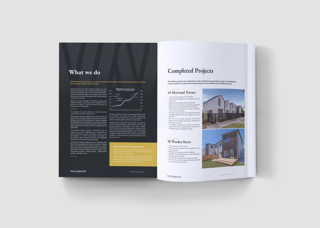
A brand you now see all around Christchurch.
Logo
Serif, classic and confident.
Brand mark
An abstract 'W'.
Typography
Traditional and modern in balance.
Let us know how we can assist your business today.
Start a conversationMost of these started as one job.
Brand strategy
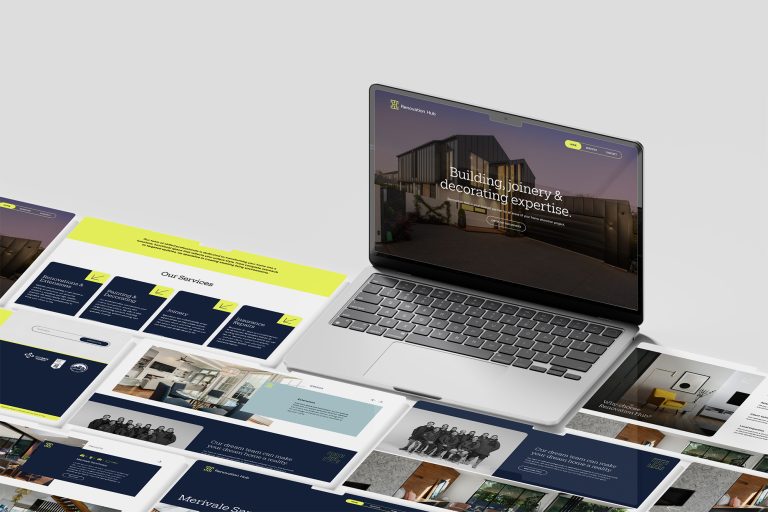
Renovation Hub
Showing every side of a renovation business, on one easy-to-use website.
A new brand and website that show a renovation team's full range, and make it easy to start a project.
Built to show the work

Brand strategy
Anthem Partners
Creating a bold brand for an advisory firm that’s anything but average.
A brand that's anything but average for an advisory firm.
Rolled out end to end

Brand strategy
Puraz
Launching a superfood range that speaks to a younger audience.
Creating a superfood range from the very beginning, for a younger audience.
A full range, created from day one
Brand strategy
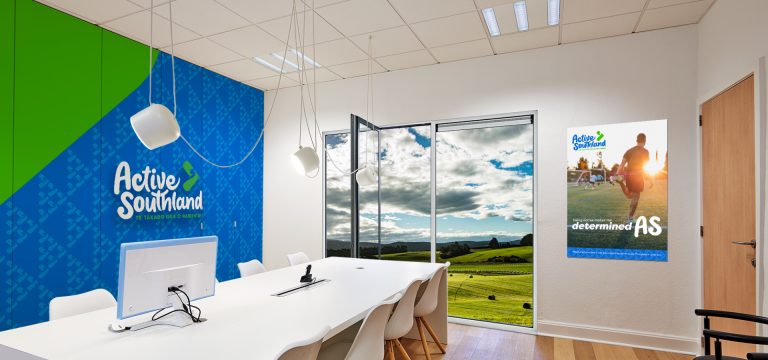
Active Southland
Renaming and rebranding a regional organisation, starting with what the community said.
From research to renaming: how Sport Southland became Active Southland.
Named by the community

Brand strategy
Mackenzie District Council
Rebranding a district council around reflections on water.
Reflections on water: a new brand for the Mackenzie District.
District-wide rebrand
Tools & resources
Find out what
your marketing is actually missing.
A short diagnostic built from the same questions we ask in a first client meeting. Six minutes, no sales call attached — you get the scorecard whether you talk to us or not.
Marketing efficiency assessment
How much of your marketing budget is actually working?
Fifteen quick questions about how your marketing is set up and managed. At the end you'll get a score, a breakdown of where you stand, and your three biggest opportunities to improve.
Takes about 3 minutes. Be honest - a flattering score helps nobody.
0%
Marketing efficiency score
Your results at a glance
What you're doing well
Your three biggest opportunities
Book a call
Your results will raise questions this report can't answer on its own - every business's numbers have a story behind them. We set aside time each week to walk business owners through their results, one-on-one: twenty minutes, no obligation. You'll leave knowing which of your three opportunities to tackle first and what it would realistically take.
Your report is on its way - check your inbox shortly. We'll be in touch soon; if you'd like to talk sooner, just reply to that email.